Greater Than The Whole.

For a small sketchbook task we got given we had to use the Mamiya 7 to photograph a building that can’t be represented in one image. For this task i decided to photograph of a manor house near where I live and to walk around the building and take pictures from every angle.

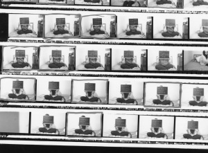
stuwork003 This is my contact sheet using Medium Format Film in the Mamiya 7. The camera was a bit difficult at first but after a few blurry photos I got some clear black and white shots. I then developed the film in the machine and used the enlarger in the dark room to create my contact sheet.

I think that if i were to have the choice I would use the mamiya 7 over a 35 mm because the images are a lot more clear and you can capture so much more. The developing process takes slightly longer and if done in correctly you could loose all your prints however the image quality at the end of process is worth it.

Assignment 1- 150 MC Final Ideas and Presentation.

For my Reality Tv photographs I’ve decided to use a box to hold my prints. After my first two rolls of film came out blurry I decided to cut down the amount of images that I’m going to have in my series. I know have 10 photographic pieces for my reality Tv series.

I asked two girls the same 3 questions, and also got the girls to hold the questions and the title of the project. I used a 35mm camera and printed in the dark room on resin coated paper.

I’ve also found some more research into the idea of using writing on my photograph.

My initial idea came from a project that I studied at college called Secrets by Simon Jessop. Jessop asked people to write down their deep dark secrets on a chalkboard and cover their faces to hide their identity.

Screen Shot 2013-11-07 at 21.18.38

Screen Shot 2013-11-07 at 21.18.49

Screen Shot 2013-11-07 at 21.19.02

The use of the chalkboard gave me the idea of how to get my models opinions into the photograph without a really long interview to go along side the images.

I then did some research into Gillian Wearing who created photographs very similar to Simon Jessop’s work. Wearing didn’t use a chalkboard in her project but instead used a white sheet of paper. She also didn’t cover peoples faces as well which i think works really well especially with the image below because it shows that the man is proud of who he is.

Screen Shot 2013-11-13 at 23.22.02

I then started to look into the Post Secret Blog. The idea behind the page that people upload pictures with their own writing over the images, usually their secrets or opinions.

Screen Shot 2013-11-28 at 16.12.40

I then did some more research into the bad influence of reality Tv,

http://www.dailymail.co.uk/news/article-2142730/TOWIE-culture-risky-role-model-say-Girl-Guides.html

The news article I read suggested that teenage girls are looking up to reality Tv as role models and that they are encouraged to live the “champagne lifestyle” and ” drug taking is acceptable and having sex at 14 is normal”

stuwork004 These are my contact sheets for Assignment 1. I used 35mm film and gloss paper to create this contact sheet. My final prints have also been printed on gloss resign coated paper and are presented in a box.

Carolyn Lefley- Guest Talk.

On the 15th November Carolyn Lefley came in to talk to us about her career as a photographer.

She was a Coventry Student and was inspired a lot by Robert Rauschenberg and the idea of home. The home in her view is a “lens to look at life through” The house is our corner of the world – our first universe. The spacial awareness of your own house can bring back memories. i.e. walking up certain stairs or certain latches on the door. I think the idea of your house being your first universe is really clever. Everyone remembers their family houses so the idea that a certain object can bring back memories is really quite beautiful.

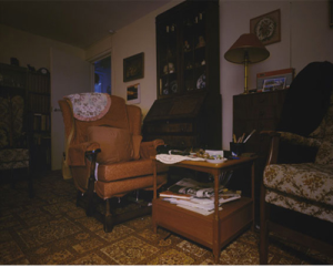
Her first project was a series of photographs taken in her family home.

Screen Shot 2013-11-28 at 14.47.10 Screen Shot 2013-11-28 at 14.46.49

In 2004 she created a project called The Watchers  in which she photographed the home from the view point of a television. Shot on film and tried with both the occupants and without the occupants in the photograph.

Screen Shot 2013-11-28 at 14.58.55 Eva- 2005.

Screen Shot 2013-11-28 at 14.59.10 Ida- 2005

In 2006 she then created a series called Semi- detached in which she photographed her friends semi detached houses.

Screen Shot 2013-11-28 at 15.14.47 The Stairs- 2006.

Screen Shot 2013-11-28 at 15.15.10 The Kitchen- 2006

I really like the way that the houses that are next to each other and they have completely different owners but the houses are very similar. In 2006 she started a project called Belonging in which she photographed dolls houses purposely to make them look like real houses until you look closely at the images and you realise that it is in fact a dolls house.

Screen Shot 2013-11-28 at 15.28.54 Screen Shot 2013-11-28 at 15.29.05

In my opinion I think all of her work is really interesting and I think she has some really creative ideas when it comes to the home. She’s really made me re-think how important my house can be in someones life.


Sketchbook Task- Memorable Object.

Assignment Brief : You should make an image or set of images which pay homage to an object that is precious to you. There should be no text and so you must communicate the value of this object by your images alone. Think about scale, angle, light, framing, the environment, the context etc.

I found this assignment quite fun because I had many things I could photograph but I had to find a new interesting way to photograph the object/ objects.

I decided on a childhood toy that I’ve had since I was young and so I tried to photograph the toy from if you were a small child lying next to or with the toy

.FInal photograph 2


Final Photograph 1

What is Fine Art?

At the beginning of the lecture we looked into what everyone thought the definition of Fine Art.  The actual definition of Fine art is :  “The use of skill and imagination in the creation of aesthetic objects, environments, or experiences that can be shared with others”  I think fine art is a very broad subject and for me its the idea of being creative and making your own piece of work unique to others and impressing those who view it.

We then started to talk about Aboriginal Art and how they’re art was meant for others to see, so that the tribe that painted the cave paintings could tell there stories to others. In many ways this isn’t much different to what we do now except of the revolution in the way we portray our work. The whole idea of a gallery is to show our work off to others. The art work or photography might not be telling a story like the aboriginals were but we still want to show our work to others.

We looked at an image of the Virgin Mary, and how they artist painted religious symbols into the painting. i.e. the cross in the middle of the image, the Halos above the women’s heads makes them seem saint like .

Screen Shot 2013-11-27 at 20.36.08 Dante Gabriel Rosse/The Girlhood of Mary Virgin 

Next we looked at another image of the Virgin Mary from the point of view of Chris Ofili. His image of the Virgin Mary was very controversial as he used elephant dung in his image. This was strongly disliked by many religious people/ groups that felt it was offence. However without the use of the elephant dung in the image I don’t think it would have become so famous.

Screen Shot 2013-11-27 at 20.40.47

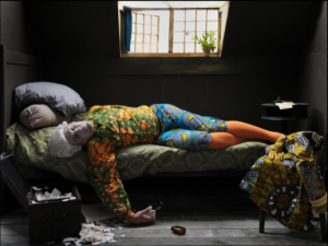
 We then looked at an image by Yinka Shonibare- Fake death picture (the death of Chatterton- Henry Wallis)
 The Original ( bottom image) was painted by Henry Wallis called The Death of Henry Chatterton in 1856 titled Without Art I Am Nothing. The poet in the image had killed himself because of his poetry. Yinka Shonibare has put his own twist to the image by adding African culture.
Screen Shot 2013-11-27 at 20.47.07
Screen Shot 2013-11-27 at 20.47.18
We then looked at Tom Hunter’s image “The way home”.
He finds his inspiration from stories in the local newspapers and the news and recreates what has happened through his photographs. An example of this is the image we studied in the lecture of a young women floating in a small river. Hunter got the inspiration for this image from a news stories of a young girl that had fallen in a river and drowned on her way home one night.
Screen Shot 2013-11-28 at 12.42.28 The Way Home- Tom Hunter.
I personally think this could be seen as wrong in a way especially for the families of the person that has passed away. Its not that the images are specifically frightening or gory but quite shocking because we know that this must have happened to a real person.
The Influence of Photography.
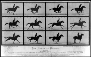
The beginning of photography influence art quite a lot especially when it came to art work that moves. In the lecture we looked at the photograph by Eadweard Muybridge called MoVon Studies 1877 Gericault. Its a series of images taken as a race horse ran along a track. Muybridge set up several cameras along the race track and set them off one after another to capture the horse running, because of his photographs they learnt that horses feet don’t leave the ground all at once but one after the other.
Screen Shot 2013-11-28 at 12.58.33
We then looked into Modern Art.
Firstly we saw Marcel Duchamp’s image of the urinal that he entered into an art competition and surprisingly won despite just writing his signature on the urinal. He made a statement about what is art? His photographs seem to be taking the mick with his images. The photos is titled “Arts for Arts Sake”, this lead us into talking when does something actually become art? Will we ever know? I think what is art depends on the person viewing it. What one person views as art an another might disagree.
This lead on to the conversation of artists such as Tracey Emin and Damien Hurst’s work and whether they have gone too far and if their work is in fact art work? Tracey Emin puts her life into her artwork. It can shock people but it also can fascinate people as well.
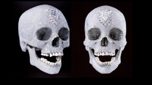
One piece of work we studied was Damien Hurst’s crystal skull. As he didn’t actually make the product himself but instead he got a company to get a skull he’d bought in diamonds and crystals.
Screen Shot 2013-11-28 at 13.08.53
Another thing we looked into was artists that steal other peoples work or advertising photographs and use it as their own.  The image by Richard Prince of the untitled Cowboy was a photograph stolen from a Marlbro cigarette advertising.
Screen Shot 2013-11-28 at 13.26.06

Deconstructing an Image. 150 MC…

As part of the lecture we discussed how to deconstruct an image.  Before trying to deconstruct a photograph we need to know key things about the project before we start.

Denotation:

–  What is in the frame
–  The colour of the image. i.e. monochrome or colour.
–  The title can give away a lot about the image.:
–  The place
–   The era/ time.
–  Who its photographed buy.

How to talk about the image:
–       Descriptive
–       Title
–       Look into the other images in the series
–       Research into the photographer.
–       Compare the work of related work.
–       Look interviews
–       Typologies
–       The theme of the images.
–       Essays on the project.

What is a Landscape?

A Landscape can either depict nature or urban environments and is traditionally a panorama or landscape orientation.

They often intended to represent places we have never seen and can be devoid of people. For me I think the most popular form of landscape is that of countryside seascapes. They don’t just have to be taken landscape they could be square or even portrait.  A landscape can also represent places we may never have seen before or make us think differently of the places we pass all the time.

This image below is by Peter Bialobrzeski and even though the image is fully populated with moving cars we can not see any individual people. He has managed to capture human presence without any visible people.

Screen Shot 2013-11-27 at 19.01.04

This means that landscapes don’t just have a natural view but can be urbanscapes, city scapes, night scapes and sea scapes and more.

Human Presence is quite popular in modern landscapes, it can be anywhere, in buildings, cars, rubbish, people themselves etc. In the lecture we looked at a piece of work by Edward Burtynsky called Oil.

Screen Shot 2013-11-27 at 19.40.06 Even though there are no humans in this picture we still see the shocking human presence in this urban landscape. The mass of tires in this photograph shows our extreme need for oil.


What is a Portrait? 150 Mc Assignment 1

What is  a Portrait?

A portrait depicts a person but can also capture the essence of that person as well. Obviously portraits don’t just have to contain people but can contain animals and other objects as well. It can be a painting/ photograph or image of a single person or group of people. They can be staged or natural and I think that natural portraits capture the emotion or essence of a person better than if it was staged. With some

I think Nan Goldin is one of many photographers that can capture people naturally, almost making the camera part of herself so people are natural around it. This image below is by Nan Goldin and this photo breaks the rules of normal portraits:

It’s not posed, the subject isn’t looking at the camera and the smile on her face makes us think she’s either laughing or about to and this makes us wonder what is going on in the image.

Screen Shot 2013-11-27 at 11.54.43

However on the other hand a staged portrait can also show someones lifestyle, for example Richard Avedon‘s photograph of the bee- keeper. This photograph is obviously staged but it also captures his way of life. If the bee’s were not put on his body like that would we know what he does in life?

Screen Shot 2013-11-27 at 12.11.33

We can find portraits everywhere: Galleries ,Portfolios, ID, Family Portraits but I think the main use is Advertising and Publications such as magazines and newspapers.

What is a photograph? Critical Reflection.150Mc Assignment 1.

As one of my lectures for 150 MC we discussed “What Is a Photograph?”

I started by listing the basic attributes of a photograph:

·      Colour/ black and white
·      Portrait/ Landscape (ratio and edges)
·      Emotions can come from the image.
·      May not cause emotions but you know what’s happening in them.
·      Still image.
·      2d print.
·      It flattens the world.
·      It has edges.
·      It is a window to the world.
·      It is fixed in time
·      It is a truth.
·      It has denotations and connotations.
·      It involves a relationship between its participants.

“A photograph can be viewed on several levels, To begin with, it is a physical object, a print. On this print is an image, an illusion of a window on to the world. It is on this level that we usually read a picture and discover it’s content: a souvenir of an exotic land, the face of a lover, a wet rock, a landscape at night. Embedded in this level is another that contains signals to our mind’s perceptual apparatus. It gives ‘spin’ to what the image depicts and how it is organized”- Shore, S (The Nature of Photographs) 2007

We have multiple levels, we have a window to the world, we have postcards and we have treasured images of loved ones, we have this idea that signals from the image interact with our own perceptions and adjust our reading of the image.

These are obviously basic attributes and it is up to the photographer to add things like meanings and evoke emotions in the viewer. However I feel that it may be easy to take a photograph but it is another thing to evoke feelings from the viewer or make them relate to the image to something similar.

How does a camera add depth to a 2d image?
–       Composition.
–       We make a connection between what is in the image to what we know in real life.
–       Depth of field.
–       Even though a camera can only work in 2d the angle/ depth of field can make the two words collide and make them seem either flat or 3d.
In the lecture we looked at the image Sawdust Mountain by Eirik Johnson. This is a great example of how a 2D image can appear to be 3D. We follow the lines of the image i.e. the tree that almost cuts the image in half and takes our eyes to the house at the bottom of the image but also the depth of field draws our eyes to the pine tree that is almost taking over half the image. However some viewers eyes might follow the line of the pathway up to the house.
Screen Shot 2013-11-26 at 19.11.26
The window to the image:
When using 35mm or SLR we look very close into the window of the image to focus. However with the mamiya medium format camera we look at the window from far away so we can see more of it.
Some images might fit perfectly into the frame; however there may be an image that breaks the window.
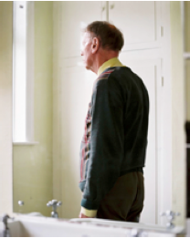
The idea that we can use edges and that the photograph can be a window can be seen through the image of a Man staring out the window by Christopher Dunn.
Screen Shot 2013-11-26 at 20.25.24 Falling Into Day- Christopher Dunn.
With the man not looking at the camera but instead out the window we, as the viewer begin to wonder what he may be looking at and we also begin to think up our own story as what could be going on within the photograph.
Cropping can also effect an image. In the lecture we looked at the same image cropped 3 different ways. When an image is cropped a certain way it can cut out important parts of the image but can also change the way we look at the image as well.
 Screen Shot 2013-11-26 at 20.37.21 This first image is cropped as a portrait and without looking at the original we don’t know that we are missing parts of the photograph but if we look closely we can see the back end of the car that is in the original and its quite a cramped photograph.
 Screen Shot 2013-11-26 at 20.37.28This image is different from the first and shows a lot more detail. I think it looks a lot better than the portrait crop and seems less cluttered.
Screen Shot 2013-11-26 at 20.37.40Original
We also looked at the idea that an image is still and a fixed moment of time. We had a task to bring in a photograph of anything we wanted. It could be a family photograph, a magazine advert or any form of photograph we could find. I chose to bring in a family photograph. We looked at how the image is a fixed point in time, it may be an important point in time especially if its a family photo. The photograph might bend, rip or yellow over time but will always contain that fixed point in time.
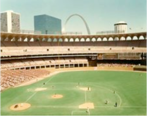
We also looked at the idea of being able to tell the era that the image was taken by the style of the image.  An example of this technique is with the photograph below taken in 1980. If we compare this image to colour photographs now a days we can tell from the graininess and the saturated colour that it is from early developments of colour film.
Screen Shot 2013-11-26 at 21.27.35 St Louis and the Arch, 1981 Joel Meyerowitz. 
Its Denotations and Connotations:

denotation: a literal meaning of the word (or image)

connotation: an association (emotional or otherwise) which the word (or image) evokes.

The idea of Connotation and Denotation really interests me and when I take photographs myself I wonder whether I can portray emotions and make the viewer of my images feel that emotion or find a link to something they may have seen before.

A truth. An image can help us see the truth but also deceive us.Photographs can become an illusion, the camera never lies. The process and the photographer is what has deceived us.It is the choices that the photographer makes that deceives us. The camera just records what is there.

A tilt-shift lens which can produce images like the one below. We see the image as miniature as we associate the shallow depth of field and small plane of focus with this style of photography, yet it is a full size bridge. A photograph shows a truth even if it’s not the truth.

Screen Shot 2013-11-26 at 21.11.04
An image can be Art.

We are surrounded by photographs, the vast majority of which are utilitarian but sometimes the boundary can be blurred and the context in which images are seen came become really important. Every image can be classed as art but I think it depends on the viewer of the image whether it is art or not. When does a photograph become art? For some a family photograph can be classed as art but would that image be classed as art if it was placed in a gallery. However there is a worldwide point of view that many of the art work we find in galleries now a days isn’t in fact ” proper art” anymore.

“The operator is the photographer. The spectator is ourselves, all of us who glance through collections of photographs – in magazines and newspapers, in books, albums, archives… And the person or thing is the target, the referent, a kind of little simulacrum…” – Barthes, R (Camera Lucida) 1980 
A viewer takes an active role in the reading of an image and brings their own opinion with them to what they see. I think in many ways this could be bad for the photographers especially when photographing something shocking and contra-virtual i.e. War. If the viewer is already biased to the subject then that will instantly take on their own view regardless of the what the photographer is trying to portray. However I feel the job of the photographs is to change the viewers opinions or let them see both sides of the subject your photographing. This on the other hand could work quite well for the photographer because if people have strong opinions on the subject then it can evoke strong emotions.
Studium: that which interests us. it may draw our gaze, we may find it visually interesting, intellectually interesting, etc.
Punctum: That which grabs us, breaks the Studium

“The studium is that very wide field of unconcerned desire, of various interest, of inconsequential taste: I like/I don’t like. The studium is of the order of liking, not of loving; it mobilises a half desire, a demi-violation; it is the same sort of vague, slippery, irresponsible interest one takes in the people, the entertainments, the books, the clothes one finds ‘all right’ “- Barthes, R (Camera Lucida) 1980.

The Studium might grab us and capture our attention however we may forget this image in a short amount of time. Not everyone has the same reactions to an image. I think this links really well to the idea of the viewer and the photographer. The photographer should use Connotation to evoke a feeling in the viewer and make us remember that image for a long time after we’ve seen the image. If the viewer is already interested in the subject that is being photographs then they will remember it as well.

The photograph relies heavily on Context, here are some of the variables that could have an impact the image:

Pairings
Sequencing
Scale
Presentation methods – exhibition/book/box etc Titles

Artist statements

Previous work

Medium

Adding a title to our photographs can also change the way that it is viewed, for some photographs titles are key to explain what the image is or what is happening within it. However a title could also distort the readers view of the image. One might look at a photograph and think of their own opinion be it good or bad, but after reading the title it could change their view or even surprise them.
Screen Shot 2013-11-26 at 22.14.25 To give an example of the use of titles, this photograph was taken from a series by Niki Feijen of Abandoned Houses. Without the name of project many would presume that this was just a normal if not strange looking house. However for me when I found out it was an abandoned home I felt shock to see that the house is still preserved despite it having no inhabitants and that the peoples possessions are still there.

Good or Bad Image.

I was given the task of finding two images that are “good or bad images”. I’ve started by looking into the definition of good and bad.

Good- ” having the required qualities; of a high standard”

Bad- “not such as to be hoped for or desired; unpleasant or unwelcome”

I think with photography it depends on the viewer to decided whether they think its a good idea, however everyones opinions will be different to others. I’ve decided to choose two Photographs buy Mario Testino that I think could be taken as good or bad images depending on the viewer.

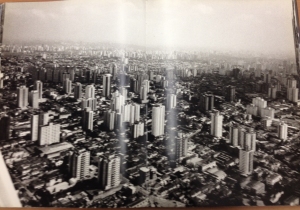
The first image is of  New york Skyline, the image is in black and white and very similar to other landscapes of the city. This image is very clear and crisp and everything can be seen clear- this can be constituted as a good image however from another view it could be classed as a bad photograph because it is so original and similar to other image.

photo 4

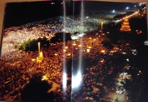
The second photograph is a landscape of a party in Rio. The image is distorted, blurry and out of focus. Whilst its hard to see whats going in the picture due to its blurriness you could argue the fact that this image is better than the first image because it captures the party perfectly.

photo 1

In my opinion I think the “good image” is the 2nd. It’s captured the party perfectly and even though its not as crisp and clear as the landscape. I feel that this one captures the Rio nightlife perfectly.