Monthly Archives: May 2014
Exhibition Review: William Eggleston.
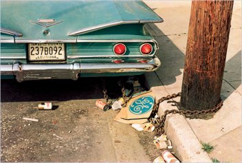
William Eggleston is an American photographer and his early work was inspired by Robert Frank’s work and Henri Cartier Bresson’s book “The Decisive Moment”. Eggleston started experimenting with colour printing in the 1960’s but at that time, colour photography was principally associated with commercial industries such as advertising.
The exhibition we visited was a series of work named Untitled 1970-1973 and it contains a group of photographs taken in Memphis. The series shows many images varying from toilets to empty petrol stations. What captured my eye most about the pictures was the colours of them. They are so full of colour and eye catching that you can’t help but stare. Many of the photographs are also very empty and lack people which for me represents the whole town and the lifestyle of those that live within it. Although Eggleston may be a popular photographer his untitled exhibition didn’t get many good reviews at all. “The most hated show of the year,” one critic wrote and some sniffed about a show whose photographic subjects also included a tiled bathroom wall, the interior of a kitchen stove and the contents of a freezer. Hilton Kramer called Eggleston’s images “perfectly banal” and “perfectly boring” whilstKramer, the New York Times’ chief art critic, was playing off of John Szarkowski, (MoMA’s director of photography), who had described Eggleston’s photographs as “perfect.” Instead of perfection, Kramer stated he saw “dismal figures inhabiting a commonplace world of little visual interest.”
For the exhibition was different to anything that i’ve seen before but the photographs just didn’t seem to flow into one another and they all seemed somewhat random with no true meaning behind them at all. Most of Eggleston’s work is similar to his Untitled project and he seems to leave most of his work without titles at all.
I think that if I was to be asked about the exhibition I would not recommend it to just anybody but somebody that can understand the context behind the images themselves. I think the images work well together however as stand alone images they would be even more confusing than they are as a series. I really like the way that photographs were framed and laid out though. Having them at eye height around the room made it almost feel like we were walking through the town in which he grew up in ourselves. The most iconic photograph within the exhibition is that of the tricycle in the empty street, is currently under offer online on a website named Christies for $578,500. (http://www.christies.com/lotfinder/photographs/william-eggleston-untitled-1970-5536850-details.aspx)
Amongst the emptiness of the photographs we discover significant political events within the series as well. Eggleston seems to have highlighted the era from the growing prominence of white Southern culture in the ’70s and Richard Nixon’s Southern strategy to the popularity of rock bands like the Allman Brothers and Lynyrd Skynyrd to the election of Jimmy Carter.
Overall the exhibition can only be described as anticlimactic and boring for me as the images held no consistent theme or meaning However I can appreciate the amazing colours and creativity behind the printing process and style in which he has taken his images.
Exhibition Review, David Bailey.
As part of 152MC we are mainly focussing on light in photographs and other forms of light when creating alternative darkroom processes so for the exhibition review I’ve decided to talk about the lighting in a few of David Bailey’s images from his current exhibition at the National Portrait Gallery in London, titled “Stardust” that I visited on the 18th of May.
http://www.npg.org.uk/whatson/bailey/exhibition.php
For this review I’ll be looking at two iconic photographs by David Bailey and analysing the lighting that I think he has used in the images.
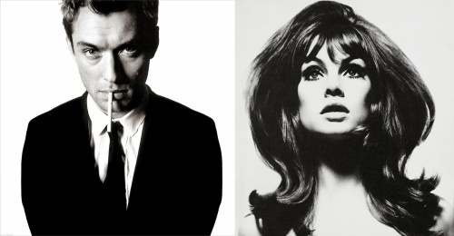
The first image is of famous actor Jude Law. The photograph is similar to the one also taken by David Bailey of Michael Kane. The model is lit from the right hand side wish creates the harsh shadow on the left side of his face. I’d say the light is positioned above and pointing down on the model so that his hair is lit as well. I think the lighting is what makes this image, as the harsh shadow on the side of his face adds a mysterious tone to the photograph.
The next photograph is of David Bailey’s most iconic model and muse Jean Shrimpton. The image is lit from both sides of the model either at face height or just pointing down slightly towards the models face. I worked this out from the small shadows on either side of her cheeks suggesting her hair around her face are causing shadows from the lights.The lighting is flattering to the model and i feel that the image wouldn’t work work without any other lighting as using only one light would be unflattering to the pose the model is pulling .Both the images are extremely iconic and I feel that David Baileys lighting techniques show his experience in lighting his models perfectly.
Throughout the gallery there is a huge variety of Bailey’s work and that didn’t always necessarily work with the flow of the photographs. His series of nudes positioned next to his “box of pin ups” seemed to somewhat lessen the authenticity of the images for me as seeing Jean Shrimpton next to a rather large naked woman just didn’t seem right.
I also felt the rooms displaying Bailey’s work in Africa, Australia were almost out of place next to the iconic portraits he is most well known for, although the images were somewhat out of place I could still appreciate the significance of these images and the importance behind them. I think that if I were to change the exhibition in anyway I would have the environmental images in a separate part of the gallery to separate two completely different types of work.
152MC Inspirational Library Session…
152MC Inspirational library session Pre-task class
The aim of this session is to inspire you to think creatively about the way light can be used to emphasize a particular meaning in photographic work.
Pick one of following books that we looked at in groups and write a short reflective blog post (about 300 words is ok) about one artist of your choice.
For this task I’ve decided to look at Mario Testino. The Peruvian photographer is known worldwide for his portraits of some of the most famous faces – from the Royal Family to Kate Moss. Having shot campaigns for the likes of Burberry, Gucci, Dolce & Gabbana and Versace he is well known and in demand in the fashion business.
His style can vary but most of his fashion photography can be very raunchy and eye catching. He’s known for photographing such people as the Royal Prince Charles and younger Brother Harry as well as some huge celebrity names like The Rolling Stones and Beyonce. Testino tends to use bold bright colours in his images and they can appear to be very alternate, some with the model in a pose that is not always considered “normal” for fashion photography.
The Guardian Magazine describes Testino as ” The man who makes models super” and he mentions several times throughout the interview that he never stops taking photographs. His years of experience can clearly be seen throughout his work and the fact that he’s still photographing at the age of 59 is truly incredible.
The one image of his i’ve chosen to look into is his iconic photograph of the royal engagement.
I’d say the light in this image was natural from the right side by using the window however I think on the left side their would have been some form of reflector so that the left side of their bodies are not in shadow from the natural light.
I think he would have used natural light for two reasons. Firstly natural light as it is very flattering and if the setting is right it sometimes works better than artificial light and the window allows a perfect amount of natural light. Secondly the natural light makes the couple appear natural themselves and I thin Testino would have made the conscious decision to use natural light to make the Royal Couple to appear like a normal, happy couple celebrating their engagement. I also think that the use of artificial light in this image would be to obvious and metaphorically they are in the “spot light” too much anyway.
I think the lighting in this image is incredibly flattering and works wonderfully alongside the location that the Royals were photographed.
154MC- Exhibition Review Richard Mosse.
 It was recently announced that Richard Mosse’s Infra Photography has won the 2014 Deutshce Borse’s photography prize.
The Deutsche Börse Photography Prize 2014 is presented by The Photographers’ Gallery, London. The annual award of £30,000 rewards a living photographer, of any nationality, for a specific body of work in an exhibition or publication format, which has significantly contributed to photography in Europe between 1 October 2012 and 30 September 2013.
The photographs depict traces of conflicting interests in the National Democratic Republic of Congo where there was many acts of fighting, rebel groups constantly switching allegiances, frequent ambushes and sexual violence against an incredibly beautiful pink, lavender and crimson jungle backdrop.
The vivid colours throughout the images are the use Kodak Aerochrome film which was originally designed to detect targets for ariel bombings in the 1940’s. The aerochrome film is incredibly clever in the way that it registers a spectrum of light that cannot be seen by the human eye, therefor creating the vivid colours in the photographs.
I think Mosse’s work is beautiful, by using the aerochrome film has really made the horrible darkness of war appear to be beautiful and as human’s we tend to shy away from gore and things that make us uncomfortable but Richard Mosse’s work makes us look and keep on staring at these images until we realise that what we are seeing isn’t as happy as we may think.
The images are not gory which is what we expect from normal conflict/war photography and the pictures don’t truly give us a proper insight into what actually happened in the Congo however the colours of the hills to appear to be some what blood splattered.I had seen Richard Mosse’s photographs in a book before however seeing them at the Photographers gallery in a full size print was incredible. The colours of the photographs draw you in and they almost make the land look like a child drawing.
The images appear very un-realistic and almost childlike at first and the landscapes in particularly look like something out of a child’s story book. Infra is unlike any other project of Richard Mosse’s, in a sense of style more so than theme as conflict and war seem to be a re-accruing theme within his photographs. Many of his other photographs don’t depict as much idilic scenery as the Infra series however I feel it is the aerochrome film that makes the images so powerful and I would love to see the images without the pink and rad hues just to compare the two.
The Double Negative website describes Richard Mosse “as getting right to the heart of each conflict” and I couldn’t agree more that the photographs truly show the conflict in a beautiful yet haunting way. I would highly recommend this exhibition to anyone despite of whether or not they are photography bilingual as even an amateur can appreciate the beauty of the photographs.
Exhibition Review: David Bailey.
Currently showing at The National Portrait Gallery is an amazing and iconic series called Stardust by the iconic David Bailey: http://www.npg.org.uk/whatson/bailey/exhibition.php
The exhibition is full of Bailey’s most iconic work from the 60’s to recent times spanning from iconic photographs of celebrities and artists to photographs of the struggles in East Africa.
The most iconic images were that of Michael Kane, Jean Shrimpton and the Kray Brothers. The most well known images that are being exhibited are Bailey’s series titles ” a box of pin ups” which include several small black and white photographs of famous people. The images are so simple but each is different from the other. The iconic white background of Bailey’s photographs is so well known that even though he’s never titled himself a fashion photographer many believe he is one of the best and I personally agree with that statement.
I found whilst walking around the many rooms that Bailey’s project has expanded over that the photographs can truly be appreciated by any age, small children and even adults were there enjoying the iconic photographs. Throughout the gallery there is a huge variety of Bailey’s work and that didn’t always necessarily work with the flow of the photographs. His series of nudes positioned next to his “box of pin ups” seemed to somewhat lessen the authenticity of the images for me as seeing Jean Shrimpton next to a rather large naked woman just didn’t seem right.
I also felt the rooms displaying Bailey’s work in Africa, Australia were almost out of place next to the iconic portraits he is most well known for, although the images were somewhat out of place I could still appreciate the significance of these images and the importance behind them. I think that if I were to change the exhibition in anyway I would have the environmental images in a separate part of the gallery to separate two completely different types of work.
Alongside the images i’ve already mentioned there was a series in which Bailey can be seen alongside his close friends Salvador Dali and Andy Warhol which I thought was fantastic as we almost see Bailey in his natural environment. They are so different to the images in the box of pin ups series that I feel it shows a somewhat jokey side to the photographer.
The Guardian described the exhibition as “ecstatically brainless glamorama is glib entertainment for those who can’t be bothered with real art” I couldn’t agree more with the Guardian as Bailey almost makes it look easy to take these black and white portraits but I know from personal experience they are the work of a true master in photography.
Bailey’s work appear to be simple but he manages to capture his subjects perfectly, whether it be their quirkiness ( Andy Warhol) or their beauty (Jean Shrimpton). The use of the simple white backdrop lets the person shine forward and we really focus on the subject themselves. Overall the whole exhibition is truly a great homage to Bailey and his work for over nearly half a century.
Task 3- Portrait Task.
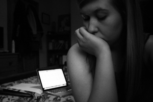 This first photograph was simply taken in my room just before I went to sleep and so i used only the light from my macbook and my bedroom light to light this photograph. I changed it into black and white to re-present the feeling I had before going to bed. Currently suffering insomnia the night time is very dark for me in more ways than on in that i very rarely sleep so I decided to use black and white to show my mood. Looking away from the camera and with my eyes closed with my macbook open in the background represents the moments where i wish that sleep would come however i’m stuck working or trying to find something to lapse my mind into some form of sleep of an evening.
 This next image was taken not long after I had woken up, again not looking at the camera and staring off out of the window is to represent the idea of a new day ahead and contemplating what the day will bring and the tasks I have to do.
I decided to keep this image quite light and I took both photographs within my bedroom to show my natural environment and the one place that remains key throughout my life.
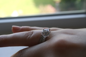
 The next two images in my series are of the rings that I wear everyday. The first image depicts the ring from my boyfriend and my parents for my 18th birthday and the second photograph is of my ring also from my boyfriend for our anniversary.
The rings are something that are constant in my life as I never take them off so i decided to focus them central to my images to show there importance.I’ve also printed these images and will mount them before displaying them
154MC. Unrepresented People In The Media
As part of 154mc were given the task of creating an artefact that explores the subject of under-represented groups within the media.
I started of this task by thinking off a several area’s in which I feel that people were un-represented in the public such as those who suffer from, Dyslexia, Down syndrome, Diabetes, and Mental Illness. I realised whilst thinking through these varying aspects of peoples life that the word “disabled” is mentioned around quite a lot within the media however I think that there are other people who may legally be classed as disabled who are also un-represented within the media, such as Deaf, Mute or Blind people which personally for me is a big problem as its stated on sightsavers. net that It has been estimated that there are 1.4 million blind children in the world, 1 million of which live in Asia and 300,000 in Africa and that Around 37 million people are currently infected with river blindness, and roughly 300,000 of them are already irreversibly blind.
The action for blind people state that “There are almost two million people in the UK living with sight loss. This figure includes around 360,000 people registered as blind or partially sighted in the UK, who have severe and irreversible sight loss.” (Access Economics, 2009)
However once beginning to think about how I would create this artefact I decided to look a little closer to home and look into my mum’s illness. Diabetes.
My mother has suffered with type 1 diabetes ( also known as insulin dependent diabetes) since the age of 7 and throughout all of my life I have watched her suffer the highs and lows of this illness. Diabetes can affect many parts of your life such as: Eyesight, blood pressure, blood sugar, diet, weight, kidneys, circulation and can even cause heart failure. Part of type 1 diabetes means that you are 100% reliable on insulin, 5 times a day, 7 days a week for the rest of your life. I’ve noticed multiple times throughout the time of helping Mum that she’s not always comfortable discussing her illness, and she’s even less uncomfortable with doing her insulin in front of people that she does not know for example in a restaurant she will use the toilet instead of using her insulin in the restaurant itself. For me there is no question when mum does her insulin or tests her blood sugar but talking with her recently I’ve began to realise that she’s very conscious of those around here when performing these tasks on a day to day basis. I’ve decided to take a series of images of mum and part of her day to day routine of being diabetic and just how much it has affected her and still does to this day.
I began to research into the illness and just how much information there is about the illness in the news:
http://www.mirror.co.uk/lifestyle/health/juvenile-diabetes-hundreds-children-becoming-3500202- The Mirror.
http://www.theguardian.com/society/2014/feb/06/scientists-closer-stem-cell-cure-type-1-diabetes.
Here are my final images that I’ve chosen for the series, depicting what my mum has to do for her illness every day. I’ve done them in order of what she does throughout the day, beginning with her testing her blood sugar, her insulin is 5 times a day however i chose to only use 2 photographs instead of 5 as i felt the subject would be to repetitive within the series. The next photograph depicts her recording what she eats/drinks and finally her blood pressure tablets and other forms of medication which she takes for the illness.
I made the conscious decision to include the photograph of my Mum injecting herself with incline even though for some the image may be un-comfortable this is a part of her everyday life. I feel that the images only show part of her life and I would love to carry on the images and show some more of my Mothers condition.
Task 4: Review of Easter Task.
 During this module I have also learnt a lot of interesting alternate process’s such as Salt Prints and Cyanotypes and I have also added to my skills in pinhole photography and photograms. I enjoyed Salt Printing so much so that I decided to use this for my human presence project because even though the process is complicated I love the look of the image afterwards and I think it looks really earthy and I also love the contrast in the images.
Cyanotypes were really fun to learn about also however I found the blue and white to be slightly to unflattering and I didn’t find the final effect all that interesting.
I found working with pinhole really quite interesting and making my own pinhole camera for the first time was really quite interesting and although it didn’t work every time I do love the after effect of the process.
I also think that my understanding of lighting in photography has increased greatly and I’ve really began to think a lot more now how the lighting is going to look before taking the image as well. Using the lighting diagrams has helped me greatly in remembering all my lighting set ups so that I can re-create the photographs again.

